Here are three simple things to focus on for developing a brand image, and how those three things translate to a consistent brand for your firm.
1. Color
One of the easiest ways to "brand" is by selecting a color and sticking to it. Think Tiffany (blue), UPS (brown) or Chanel (black and white) -- these brands are inextricably linked to the colors associated with them. Choose a color that you like, or a color whose meaning you like. Whatever you do, make sure you can stand to see it every day.
2. Font
Or to design people, typeface. Select a typeface that you like, and that you believe represents the values of your firm. Are you a Times New Roman (serif) person, or a Helvetica (sans serif) fan? Whatever you do, select something that looks professional and easy to veiw to a user.
3. Logo
You can hire a graphics designer to design a logo for you, or you can play around in Word with various fonts, colors and sizes. If you hire a designer, tell them where and how you plan to use the logo so they can design with that in mind. If you design it yourself, definitely run it by some people who won't be afraid to be honest with you.
Now that you have a plan for how you want your brand to look, make sure the look is consistent across all of these categories:
1. Online
Your website, blog (or blawg), and/or social media should have the same user profile, and the colors you use should be consistent with the color you've chosen to represent your brand. Ideally, if a client went from your firm's website, to your Twitter account, it would look like they were for the same firm.
2. Busines
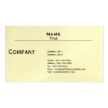
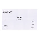
Business Cards & Letterhead
Any type of materials that you print with your firm information (court documents excluded) should reflect the color, font and logo, if any. If you were to hold your business card next to your letterhead, they should look like they are related.
3. Marketing Materials
Being mindful of your local attorney advertising rules, whatever limited advertising you might engage in, should accurately reflect your brand.
4. Office Decor
Your office is also a reflection of your brand, and you can incorporate brand elements into your office decor. Adding accents of color -- that match the color you chose are a great way to liven up the place. Also, and signage, or lettering on doors should also reflect the same typeface you used elsewhere.
You may think that aesthetics are not important, but they are. People are very visual, and if all of your branding is consistent, people will perceive you as consistent -- something clients will value in someone who represents them. Of course these suggestions are very basic, but they are an excellent place to start.
Related Resources:
- Information About Legal Services Rule 7.2 Advertising (ABA Model Rules of Professional Conduct)
- Launching a Law Firm? You'll Need a Good Profile Pic (FindLaw's Strategist Blog)
- Maniacal Marketing: The Best and Worst Law Firm Ads (FindLaw's Strategist Blog)


No comments:
Post a Comment